
In the ever-evolving world of marketing and branding, every little detail matters. From your logo to your website to the stickers on the back of your car, each element plays an important role in how people perceive your brand.
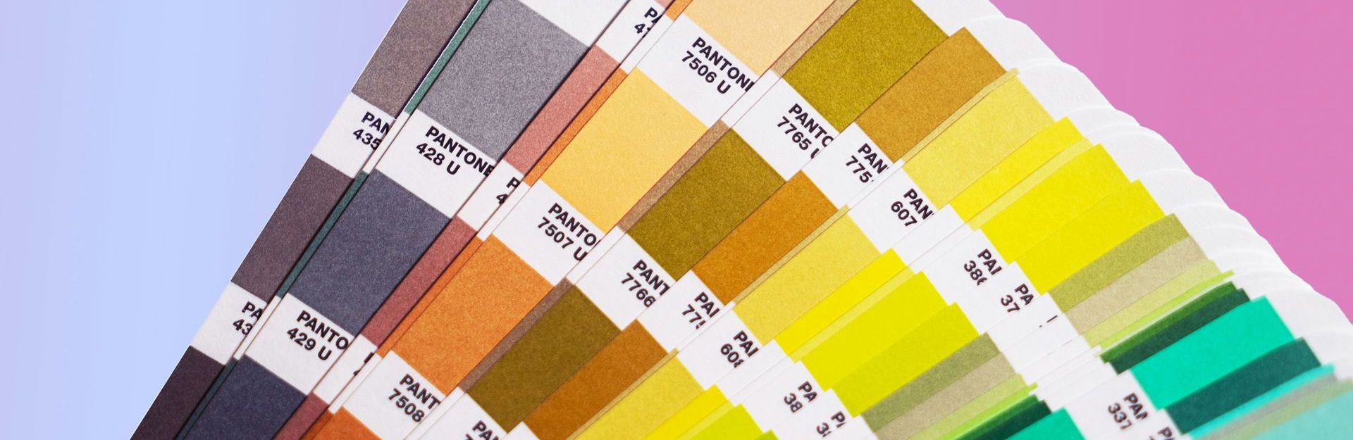
Sure we can chuck in a lion to show your strength in business, maybe a wave here or a tree there to let your target market know how chill and easy going you are… but have you ever thought about how impactful your colour choices can be for your brand? Seriously, there’s science behind it!
Countless studies have proven that different colours can make us react and respond in a variety of different ways. It’s almost like a secret tool we can use to trigger feelings and mental associations in our audience (and trust me, it's easier than you think!) 🤫
So, how do you decide what colours to use in your branding? Great question! Today’s your lucky day - below are some examples of how colours can influence your target market. Plus, we’ll even throw in a bonus downloadable cheat sheet at the end for you to reference on the go.
RED
Often associated with passion, energy and excitement, red can be a powerful choice for brands aiming to create a sense of urgency or evoke strong emotions. It’s no coincidence that hospitality and entertainment brands like McDonalds, Netflix and Coca Cola incorporate red into their branding to stimulate appetite and excitement for their products.
ORANGE
Symbolising optimism, warmth and confidence, orange is often used by brands wanting to show enthusiasm and generosity. ING, Fanta and Amazon use orange to promote abundance and confidence.
YELLOW
Radiating optimism, creativity and youthfulness, yellow can be a perfect choice for brands aiming to grab attention and foster a sense of positivity. Brands like IKEA, Subway and JB HiFi incorporate yellow to evoke feelings of happiness and energy.
GREEN
With its associations to nature, growth and harmony, green is often used by brands promoting sustainability, health and eco-friendliness. Companies like Woolworths, Starbucks and Medicare utilise green to align themselves with feelings of rejuvenation and promote a sense of well-being.
BLUE
Symbolising trust, stability and professionalism, blue is a popular choice for corporate brands wanting to establish credibility and confidence in their audience. Tech giants like Facebook, LinkedIn and Outlook leverage the colour blue to show reliability and trustworthiness.
PURPLE
Representing royalty, creativity and wisdom, purple is used by brands wanting to evoke feelings of stability and peace of mind. Cadbury, Hallmark and Yahoo! use purple to their advantage to create a calming and luxurious feeling in their audience.
Phew! Although it’s a handy skill to have, colour psychology can be tricky to remember on the go. That’s why we’ve created the Colour Psychology Cheat Sheet - a pocket-sized guide that you can reference quickly whenever you need.
Choosing the right colours for your brand goes beyond personal preference - it’s about understanding your target audience, industry standards and how you want your target market to feel. Maintaining consistency across all your brand touchpoints, from your logo to your marketing and collateral, strengthens your brand identity and ensures you won't be forgotten any time soon.
Need help with your brand colours or advice on your current marketing strategy?
That’s our bread and butter, we’d love to chat!

About the Author of this blog:
Perri Adkins
Perri our legendary graphic designer. She has a passion for all things quirky and unique.
With a Diploma of Graphic Design and 6 years experience of bringing visions to life, Perri will make sure your brand stands out from the crowd and won’t be forgotten!