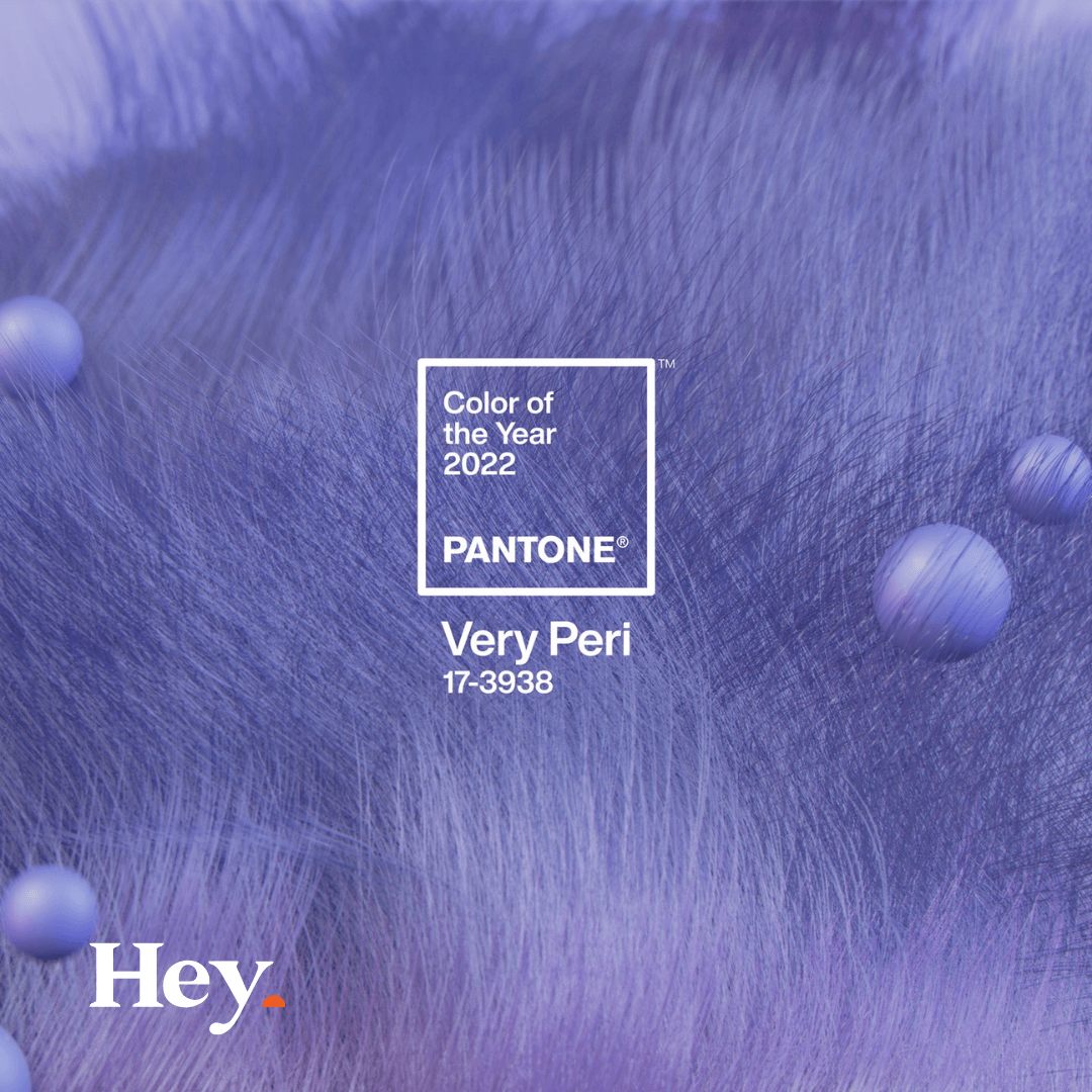
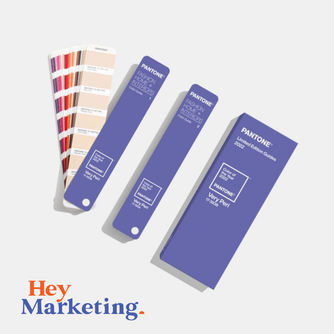
Ummmm.... that looks familiar!
We love this colour!
Hence why our brand is a very very close pantone!
This pantone is a dynamic periwinkle blue hue with a vivifying violet red undertone blends the faithfulness and constancy of blue with the energy and excitement of red. A new Pantone colour whose dynamic novel presence encourages personal inventiveness and creativity, PANTONE 17-3938 Very Peri, the happiest and warmest of all the blue hues, introduces an empowering mix of newness.
Displaying a carefree confidence and a daring curiosity that animates our creative spirit, inquisitive and intriguing PANTONE 17-3938 Very Peri helps us to embrace this altered landscape of possibilities, opening us up to a new vision as we rewrite our lives. Rekindling gratitude for some of the qualities that blue represents complemented by a new perspective that resonates today, PANTONE 17-3938 Very Peri places the future ahead in a new light.
We are living in transformative times. PANTONE 17-3938 Very Peri is a symbol of the global zeitgeist of the moment and the transition we are going through. As we emerge from an intense period of isolation, our notions and standards are changing, and our physical and digital lives have merged in new ways. Digital design helps us to stretch the limits of reality, opening the door to a dynamic virtual world where we can explore and create new color possibilities. With trends in gaming, the expanding popularity of the metaverse and rising artistic community in the digital space PANTONE 17-3938 Very Peri illustrates the fusion of modern life and how color trends in the digital world are being manifested in the physical world and vice versa.
We absolutely love this colour and we love the way that Pantone describes it. Personal inventiveness, creativity, energy, excitement, newness, carefree confidence, daring curiosity, happiness and warmth! All things we aspire to be!
ABOUT PANTONE COLOR OF THE YEAR
The Pantone Color of the Year selection process requires thoughtful consideration and trend analysis. To arrive at the selection each year, Pantone’s color experts at the Pantone Color Institute™ comb the world looking for new color influences. These can include the entertainment industry and films in production, traveling art collections and new artists, fashion, all areas of design, popular travel destinations, as well as new lifestyles, playstyles, and socio-economic conditions. Influences may also stem from new technologies, materials, textures, and effects that impact color, relevant social media platforms and even upcoming sporting events that capture worldwide attention.
For 23 years, Pantone’s Color of the Year has influenced product development and purchasing decisions in multiple industries, including fashion, home furnishings, and industrial design, as well as product packaging and graphic design.

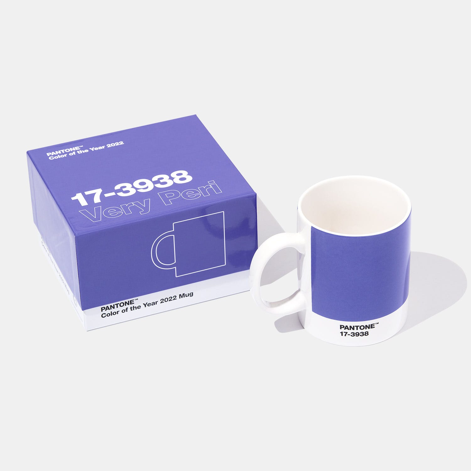
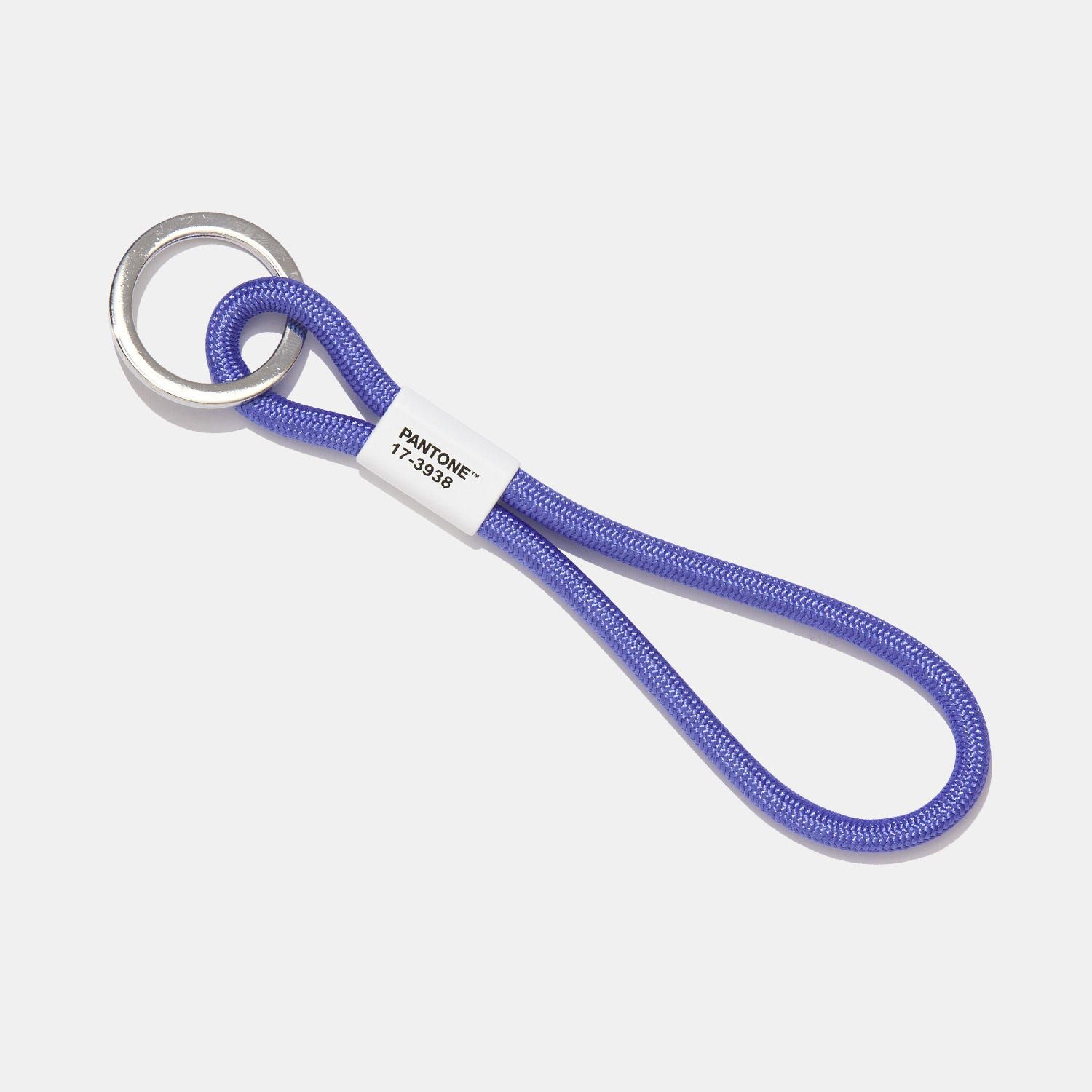
COOL PANTONE THINGS.... JUST 'COS!
We'll take 10 of everything.... just for the office.... we need to stock up!
We love it so much! Lanyards & Coffee Mugs for all!